StashCanvas
Branch, compare, and organize your AI outputs on one visual canvas
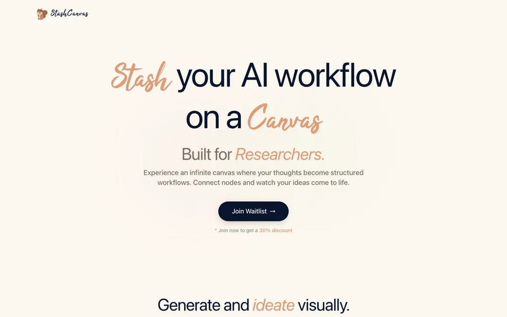
StashCanvas targets students and researchers with a visual, node-based AI canvas for branching prompts and comparing outputs. The problem is real but not urgent, and the market is crowded with Heptabase, Scrintal, and native canvas features inside ChatGPT and Claude. The landing page does not articulate why a spatial canvas is meaningfully better than tabs or chat threads, nor does it show a concrete workflow. Without a differentiated use case, the 30% waitlist discount feels premature -- you are discounting something people do not yet understand why they would pay for. The page is visually clean but functionally thin: one headline, one feature carousel, one CTA, and a footer. No testimonials, no pricing, no FAQ. The carousel demos are generic and do not connect back to the stated audience. A visitor who scrolls past the fold has no reason to trust the product or feel urgency. Adding a short video walkthrough, specific use-case stories, and a clear statement of AI capabilities would significantly reduce bounce.
This is Miro plus ChatGPT plus a mood board, which is a combination at least three dead startups already tried between 2022 and 2024. The "infinite canvas" framing has been so thoroughly commoditized — by Miro, FigJam, Napkin AI, Whimsical, and a dozen others with AI bolted on — that leading with it signals you haven't done competitive research. The subheadline cycling between "Students" and "Researchers" tells me the target isn't locked in yet, and a waitlist with a 30% discount bribe as the only CTA means there's nothing to actually try. One screenshot of robot heads branching into variations isn't a product demo, it's a Dribbble shot. That said, the specific use case of running one prompt and seeing multiple AI output variations side-by-side spatially is genuinely underserved in tools researchers actually use — citation managers, note apps, Obsidian. If you ditch the generic canvas pitch and lead with "compare AI outputs visually without losing context," and get a working prototype in front of PhD students fast, there's a narrow window before Notion or Obsidian plugins eat this lunch. The bones are there. The landing page just doesn't show them.
Hey umm, I am the dev behind this. First of all, thank you for the comments. I read the reviews and I am trying to incorporate the feedback given into the application. I have since then updated the landing page and even got a sandbox area where you can try the application. It is still not complete, but I would definitely welcome advice on how I can go moving forward to make a sustainable SaaS. Thank you once again!