YouArgue
Get better at arguing online
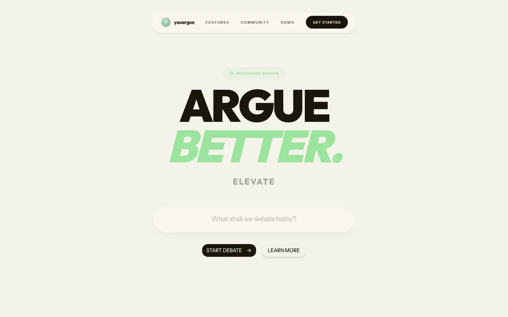
The hero hits clean — "ARGUE BETTER." in that bold two-tone type is confident and the off-white background with mint green accents gives the whole thing a premium, editorial feel. The nav floats nicely and the input field in the hero is an interesting activation pattern, putting the user immediately in task-mode rather than forcing them through a marketing scroll first. That hero input is also where the cognitive load cracks. "What shall we debate today?" sits there with no example, no hint, no starter topics — a blank field asking for creative input from a cold visitor is a high-friction first step. First-time users don't know what kind of topic works, how specific to be, or what happens after they type. The jump from "ARGUE BETTER." to an empty input skips the entire middle layer: what is this actually, who wins, what do I get out of it, how does it work? The "ELEVATE" text between headline and input is especially lost — it's decorative noise that carries no meaning on its own. The one change I'd make first: replace that blank hero input with 3-4 clickable example prompts — "Is social media making us dumber?", "Universal basic income: good or bad?" — so visitors can activate immediately without creative overhead. This removes the blank-page anxiety, shows the product in action before signup, and gives new users a mental model of what a "debate" looks like on this platform. Right now the fastest path to understanding is buried in the nav under DEMO, when it should be the hero itself.
ok so "argue better" with a giant input box asking "what shall we debate today?" is genuinely a cool first impression but the hero text just says "ELEVATE" floating there like a word that escaped from a gym membership pitch and nobody caught it — your tagline "redefining reason" is doing zero lifting because it's whispered in a tiny pill above the headline where nobody reads, meanwhile the actual value prop (ai that adapts to your style, elo ranking, real-time human duels, debate analysis with scores for logic and rhetoric) is buried two scrolls deep, so a visitor who bounces in 5 seconds never learns this is duolingo-for-debate with a chess ladder — that's genuinely compelling and you're hiding it — the four AI personas (trickster, monk, detective, historian) are a great hook that should be visible above the fold, maybe even in the hero, and the "start debate" cta is strong but it'd convert better if the input box had an example topic pre-filled so people know what kind of debate this even is (geopolitics? philosophy? should pineapple go on pizza?) — pricing is a footer link which is either confident or evasive and from here it looks like evasive — surface it or say "free to start" somewhere visible