Listnr
Usage-based alert tool to monitor Reddit mentions with intent scoring
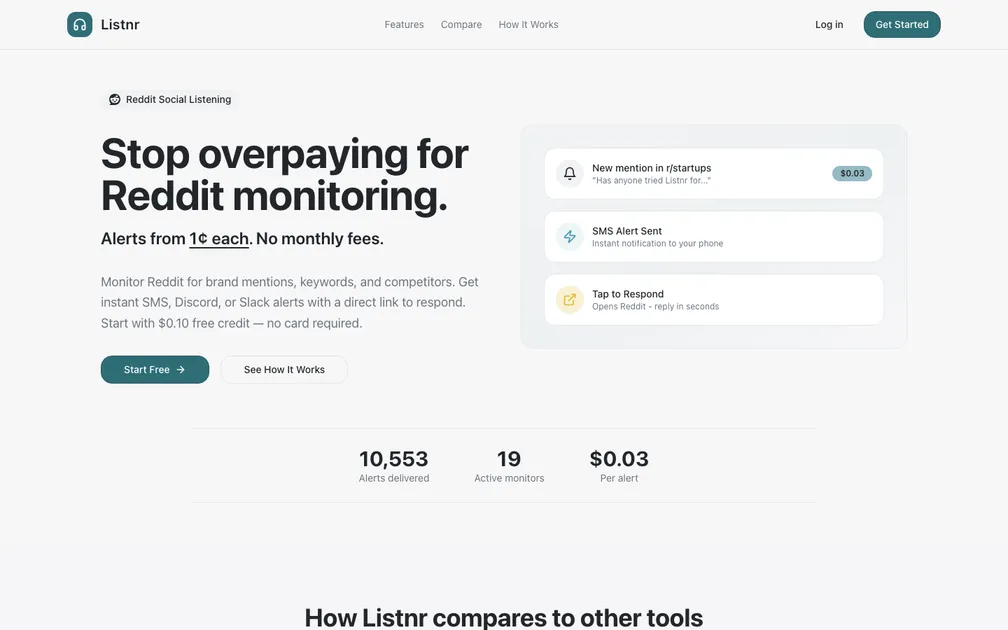
The hero lands cleanly. "Stop overpaying for Reddit monitoring" paired with "Alerts from 1¢ each. No monthly fees." is tight — the price is the hook and it shows up immediately. The comparison table and cost calculator lower in the page do real work, and the "Built by someone paying $40/mo" quote is the best line on the page because it makes the founder human. The live stats (10,634 alerts delivered, 19 active monitors) add credibility without feeling inflated. The confusion lives in the CTAs. "Start Free" and "Get Started" are the same action duplicated between the hero and the nav, but "See How It Works" sits right next to "Start Free" at equal visual weight. A hesitant visitor's eye splits between them — the secondary button is competing when it should be guiding. The hero mockup on the right (mention, SMS, tap-to-respond) is doing the job a three-step explainer section usually handles, which means "How It Works" in the nav leads somewhere the hero already covered. That redundancy costs trust. The one change I'd make first: swap "See How It Works" for something that resolves the specific anxiety a new visitor has at that moment. Something like "See a sample alert" or "Watch a 60-second demo" — anything that moves them forward without sending them to a separate section. The pricing model is genuinely differentiated but pay-per-alert always triggers a hidden-cost fear. A single line under "Start Free" like "Your first 10 alerts are on us" would dissolve that friction before it forms.